We’d all like to think that parents are happy with every aspect of their child’s school but in reality there is always room for improvement!
You may be too close to your school website to see that it could be improved so we put together this list of the most common complaints we hear from parents about their child’s school’s website.
We hope this will help in improving your school’s website.
They can’t find the information they’re looking for
We’d hope that your school website includes all of the information required by OFSTED, but what about the additional information that parents are looking for?
For example: What’s the menu for school meals? How much do these cost? Can my child have a school meal a few times a week or must they pick either school meals or packed lunches? How do I book and pay for school meals?
This is just one example of the kind of information which is rarely included on school websites and it’s a missed opportunity. This information may be sent to parents separately, for example in an email, but what if they’ve deleted that email accidentally or it’s ended up in their junk folder? Far easier to check the website for the latest information.
It takes too long to find the information they need
As a website user yourself I’m sure you’ll agree that the last thing you’d look forward to is reading all of the text on an entire website just to find the one piece of information you’re looking for! But this is what you’re making parents do if the information on your website isn’t clearly organised and labeled.
Your school website is designed for parents so you need to be getting into the mindset of a parent when you’re planning out what order the pages are in, what each page is called and what information goes where.
As a parent, if I’m looking for term dates (one of the most requested pieces of information), how do I know whether this will be in the “Our School” section, or the “Dates for your Diary” section?
It could be in both sections, but the choice forces a parent to think and explore which may not always be convenient if they just want to know what date half term is so they can book a holiday!
Parents are busy nowadays and if they can’t find what they need straight away this is likely to cause frustration… and more calls to the school office!
There's no clear signposting to important information
Signposting is exactly what it sounds like. Making sure that pathways in the user journey of your website are clearly defined so information is easier to find.
Most parents don’t come to your school website to browse, they’re there to either complete a task or get an answer to a specific question, for example “what time does my child’s parent’s evening start tonight?” or “what will my child be learning this term?”.
Parents will appreciate it if you make this process as easy as possible for them and signposting is an easy way to achieve this.
Make sure your navigation labels are simple and that information is logically ordered into sections which make sense. You can also include a signposting page in each top level section with links to pages in sub sections to make it quick and easy to find pages deeper in the site.
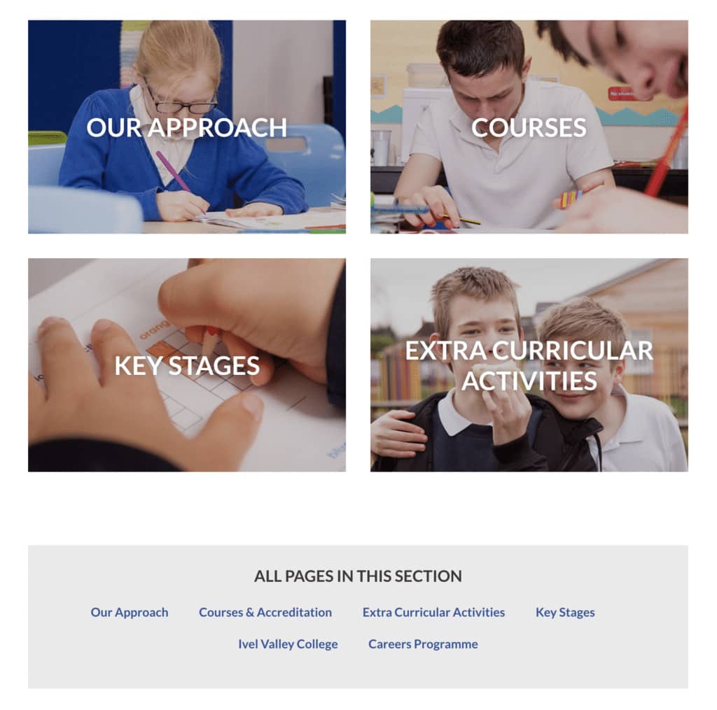
For example, on the Ivel Valley School website, the major section pages contain a list of the key pages in the section and also below, a list of all of the pages in that section. This makes it easy to see at a glance, all of the pages in each section.

Signposting is also important when posting links to other content. As a general rule it’s much more meaningful to link relevant words in your sentence to the resource or page, rather that the generic “click here”.
For example:
Click here for 10 things you should include on your school website.
Is not as meaningful as:
Find out about the 10 things you should include on your school website.
Great website signposting means that a website visitor can easily and quickly get to the information they’re looking for, without having to think too hard.
Your school reception staff will love you if your website does this well as it will mean they’ll get fewer calls to the school office!
The site isn't mobile friendly
Now that most websites are mobile friendly we all know the pain of that one website we come across that isn’t! Pinching, zooming and trying to click on tiny links isn’t fun for anyone and studies show it will cut mobile usage of your website. Parents not using your school website is not a good thing.
It’s also now more affordable that ever for every school to have their website adapted to be mobile friendly so there’s no excuse!
The site takes a long time to load
Again we all know how frustrating a slow loading website can be to use. And tests show that the slower a website is the less people will use it.
Think of it like this – if every page on amazon.co.uk took 5 seconds to load, would you buy as much? No. Which is why Amazon work really hard to make sure their website loads lightning fast.
No one has time to waste waiting for a website page to load and if this happens too often it will lead to frustration… and more calls to the school office!
The information and images are outdated
Does your school website contain information that’s not relevant any more? Details of after school clubs that no longer run? Pictures of students in old versions of your uniform or parts of the school that have now been refurbished?
It’s really important for your school’s image and credibility that whatever’s on your website is always up to date as this has an effect on what parents, staff and OFSTED think about your school. Are you up to date and organised? Do you place a value on getting things right and your communication with the wider world?
A website that’s kept up to date and relevant has an impact on the perceived answers to these questions.
There are multiple communication channels with different information
This is a big one and we hear it a LOT from parents! Many schools don’t have any sort of communications strategy, so they’re sending information out on many different channels and the information on each channel might not always be the same.
For example they might update the website with some new diary dates, then send out an email with the diary dates and some additional information that didn’t get added to the website. The information then changes slightly and it’s sent out again in a letter home or the school newsletter but the website hasn’t been updated to reflect these changes.
So now we have the situation where no one has all of the correct information which causes frustration and, yes you guessed it, more calls to the school office!
How different it could be if there were one or two channels where all information was posted, such as the school website and your school app.
If you’re using mySchoolApp, you can even send a free follow up message to all affected parents if something does change. And there’s no chance it will end up in their email junk folder as mySchoolApp uses push messaging to deliver messages directly to parents’ smartphones.
We hope this article has highlighted some areas where school communications can be improved and given you some ideas on how to make those improvements.
If you’d like to book a free consultation to have a chat about how we can help with your school website and communications, just get in contact.
