Grasmere Nursery School
The Problem
Grasmere came to us because their previous website didn’t accurately represent them as a school.
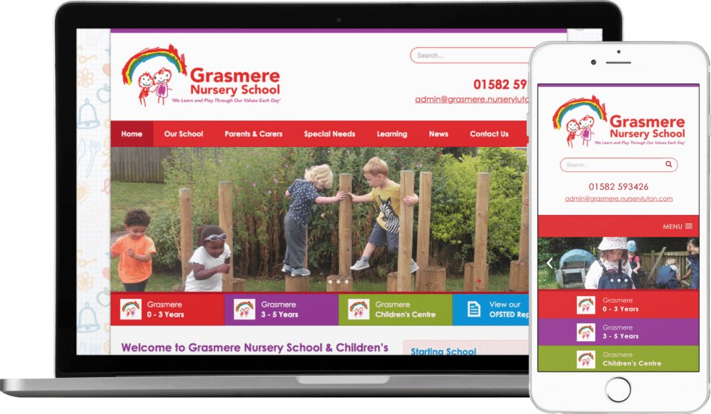
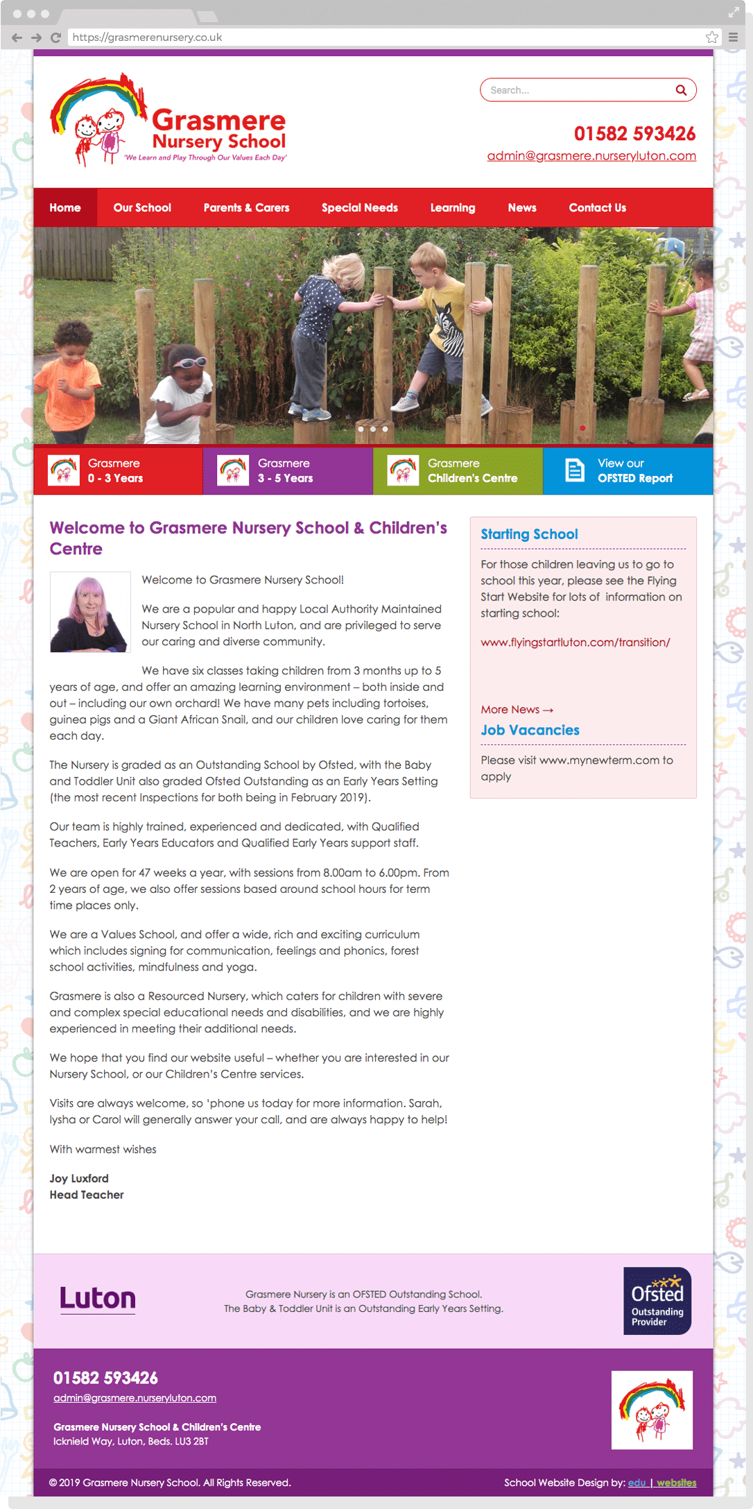
Their nursery school has three distinct parts – the baby & toddler unit for under 3s, the main nursery school and the children’s centre. These different areas weren’t coming across in the previous design though which felt cluttered and difficult to navigate.
They also didn’t have any access to update their old website which made it very difficult to manage the site and keep it up to date.
Our Approach
We started the project with our usual research and planning process to get an insight into Grasmere as a school and plan how their website would be structured.
We then developed a new easy to use, mobile friendly website with a custom design which uses bright colours and lots of pictures of the children to convey Grasmere’s warm, friendly atmosphere and establish their online brand.
The new site is powered by WordPress so it’s also really easy for school staff to update.
The Result
The more modern and simplified design has helped parents find the information they need much more easily and the feedback has been overwhelmingly positive.
The new website is also much easier for school staff to use which saves admin time and means the website is now kept up to date.
As a Nursery School and Children’s Centre, we wanted a bright, clear website that was easy to navigate for our parents, but was also reasonably simple for our staff to update independently. Chloe fulfilled this remit very well and we are delighted with the resulting website.”
Joy Luxford, Grasmere Nursery School


